Hi everyone,
I had a question about how I painted the white cloth on Alice’s apron, so I thought it was time to expand on the paint recipes section on the site.
White is a difficult colour, I have to admit. I find that it can look chalky sometimes, or look more grey rather than white. To prevent the chalkyness I would suggest using a dilution of at least 1 part water, 2 parts paint, but I would suggest diluting even more. Try to make smaller steps in between the mixing of the highest highlights, even though on the palette the difference may not look so big, on the mini it will be and it can also lead to a chalky look. Sometimes I find myself still struggling with white, I guess it comes down to much patience, much diluting and many layered steps 🙂
So here are the paints I use for Alice’s apron, a cool toned white:
Yes, I admit the colours look quite dark. They are actually, but these colour picks look a bit darker then the colours actually are. The colour names are (from left to right):
- Field Blue (058) from Vallejo Model Color
- Pale Blue (064) from Vallejo Model Color
- Space Wolves Grey (old GW colour)
- White from Vallejo Model Color
So why don’t I use more lighter colours, two reasons: firstly, I don’t really have colours to fill the step between the pale blue and white. Secondly, I actually like mixing more as that will make nicer transition.
To achieve a white look to the cloth, instead of grey or lightblue, it is important to keep the midtone area (or basetone) as light as possible. I like to start with a basetone of 1:1 pale blue and white, and a very tiny bit of space wolves grey. To make sure that the cloth becomes white, I think it helps to keep the highlightes areas much larger than the shaded areas. So I cover a large part of the basecoated area, where the highlight should be with 1:2 pale blue and white. In the next steps I keep adding white until the highest highlights which are completely white. These areas are still quite large, not tiny dots. Try to look at Alice for a reference. The top of the breasts is completely white, top of the folds also.
Then of course the shades should cover only a small area. On flat areas (like on the bottom part of the apron) I rarely used shades. In the folds I shaded by using a mix of pale blue and field blue in a 2:1 ratio. I kept adding a little field blue for the darkest shadows, as can be seen in the folds above the belt, and surrounding the sachets.
I think with painting white is is easiest to start with highlighting then the shading. During the painting keep checking from a distance if the tone stays white, otherwise dim the shading with your basecoat.
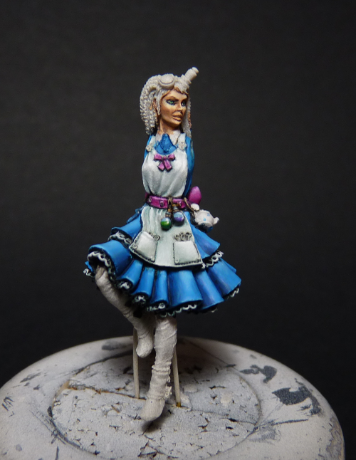
Here is a picture of Alice (still in WIP), you can see the results of these colours/steps best in the apron.
As you can see some parts still look a little chalky, but keep in mind this is a huge magnification. I guess I also should have spend a bit more time to smooth out the resin surface, but I figured since this is supposed to be cloth it does not necessarily have to be super smooth 😉
I hope you liked this post 🙂 If you want to see other colour recipes, please let me know!
