- Chaos Black (GW)
- Abyssal Blue (Scale Color)
- Anthracite Grey (SC)
- Caspian Blue (SC)
- Bering Blue (SC)
- Artic Blue (SC) – Haha annoying name, I keep wanting to add the C
- White (SC)
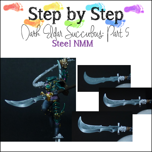
looks great in NMM, reminds me of the Rackham style. Building up the layers
look quite rough with this paints, but once you start blending I really
notice a difference from my NMM with Vallejo paint.
First Highlight
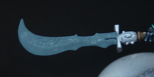
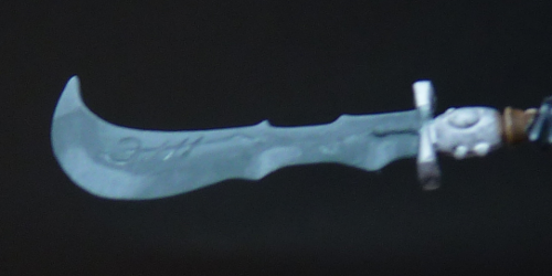
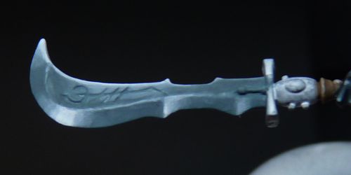
I have added Graphite and a little bit of Bering Blue to the basecoat. It is hard to tell exactly, but I think 2 parts basecoat, 2 parts Graphite and 1 part Bering Blue. With this mix I started blocking in the highlights. For all highlights and shading layers I used a layering consistency.
On the picture you can clearly see where the focus is. For the moment, I do not care about making smooth transitions. Only blocking in colours to see if it works.
Second Highlight
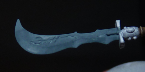
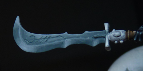
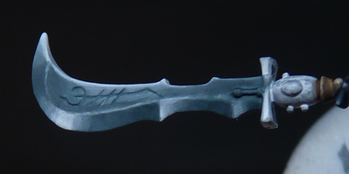
I added a bit of Artic Blue to the previous mix (3:1 ratio) and I painted that on top of the previous highlights but on a slightly smaller area. Notice that the area is still quite large, especially on the curved part of the blade.
Third Highlight
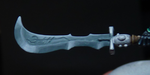
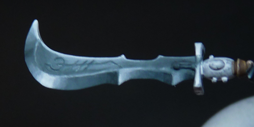
With more Artic Blue added (ratio 1:1 First Highlight mix to Artic Blue), I painted in the next layer of highlights on a smaller area even. Still I am not bothered with blending. At this point I decided that the direction and placement of the highlights looked ok to me, so I proceeded with more highlights. If I hadn’t liked it at this point, I would have started over from the basecoat. Better to make those kind of decisions earlier rather than later ;).
As you see I also used this highlight mix to paint in the rim between the two surfaces of the blade. I like to emphasize this because in my mind it gives a more reflective look to the material.
Fourth Highlight
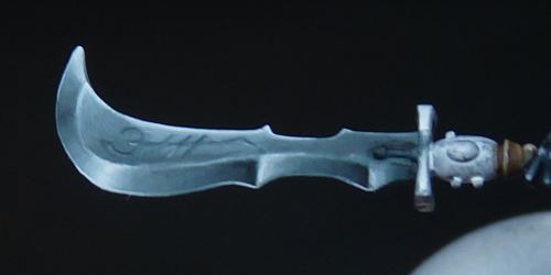
The highlights go ever on. I painted the next layer of almost pure Artic Blue. It is not completely pure as I kept adding it to the previous mix, but on my palette they looked the same at this point.
Fifth Highlight
Then I started adding White to the Artic Blue, starting slowly with a mix of 1 part white, 4 parts AB. I also make sure to paint this on a smaller area of the line between the areas of the blade.
Sixth Highlight
More white! I think the mix is now about 1:1 White to Artic Blue.
Seventh Highlight
The final highlight has got to be white. If metal reflects light, the brightest part is white. So I added White on the smallest of surfaces. But, as you can see on the curved part of the blade it is still quite large.
First Shade
To get a more reflextive surface it helps to put really light colours close to really dark colours. So of course I needed to do more shading. The first shade is done by adding Abyssal Blue to the basecoat, mix 1:1.
Second Shade
Using pure Abyssal Blue I painted another layer of shadow colour. Do you notice that I use less steps for the shading than the highlighting. This has two reasons: The first is that I started the basecoat with quite a dark colour already. The second reason is that the dark colours from Scale Color mix so nicely I didn’t feel like it needed more steps.
Final Shade
Oops! I forgot a picture here. I created the final shading by painting pure black on the very tiniest areas.
Smoothing
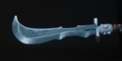
As with all the previous parts of the step-by-steps a lot of smoothing is involved in the next step. Using diluted glazes of the colours used the previous steps I made sure to blend the transitions. Especially in the highlighted areas that was needed.
Edge highlights
Then, to finalize the effect I painted edge highlights. The first layer was painted using the Fourth highlight mix on all edges. The second layer was pure white on only the most extreme areas. Because it is such a thin line, there was no smoothing necessary 🙂
